If you are planning to print your own design on T-shirts or other promotional products to promote your event, company or organization, then it would be wise to consider taking a closer look at the negative space in your designs. In a nutshell, the negative space refers to the space found around or between one or more shapes or objects. It is the “background”, the shapes which are seen between or around the positive shapes or “foreground” elements; a good real life example is the space found between a cup and its handle. Designs that make effective use of negative space as well as positive space make for some of the the most striking and creative images you can ever find—think of that popular optical illusion called “Rubin’s Vase,” wherein both the faces on the outsides and the vase in the middle have an equal presence in the hierarchy.
Why is Negative Space So Effective in Design?
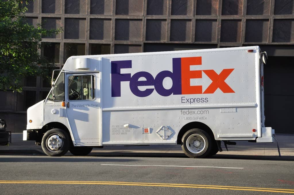
Using negative space well when designing your t-shirt design (or anything else for that matter) is very effective due to a number of reasons. The simplest reason is that an abundance of negative space eliminates clutter and draws much more attention to your design’s focal point, making people notice what you want them to notice much more quickly. It can also make for a more clever, thoughtful image, deepening the relationship between the viewer and the design—think of the arrow hidden between the letters of the FedEx logo and the excitement you felt the first time you noticed it. Finally and most importantly, a proper balance between positive and negative space can ensure your design flows well and feels neither too light nor too heavy, a challenge that’s especially important in logo design.
Clever Examples of Negative Space in Design
When designing a logo or other sort of image to promote your event, product, organization or company, you should strive to create a design that will be at once visually appealing, interesting and balanced. To get you inspired and illustrate some of the points discussed above, we’ve put together a few examples of logos that make excellent use of negative space to create impressive, memorable images.
FedEx
As we mentioned above, this is one of the most famous examples of negative space found in a logo. When you look carefully at this logotype, you will note that there is a hidden arrow between the characters “E” and “X”. The letterforms were altered just enough to make this deliberate shape emerge from the negative space, making this a truly genius design. The arrow has enough presence to feel like a logo on its own, creating an interesting dynamic between positive and negative space while at the same time suggesting a forward movement or action.

USA Network
This television network’s logo is a good example of short, simple logotype that also manages to be very memorable due to its use of negative space. The letter “S” is visible in the negative space between the other two letters, “U” and “A”, illustrating that you can minimize positive shapes and condense the space your design takes up by using your negative space to convey important information.

Girl Scouts of America
Now a classic, this much-acclaimed logo from the pioneering days of modernist design borrows from Rubin’s vase by exploiting the negative space behind one girl to create an illusion of more girls. This technique effectively condenses the space needed to convey the idea of a group of people.

Washington Capitals (NHL)
While it’s generally taught that you shouldn’t try to incorporate more than two ideas or objects into a logo, occasionally we’re proven wrong by phenomenal logos that effectively combine several ideas into a single, elegant shape. This is one such example: the negative space depicts the shape of the U.S. Capitol Building, while at the same time the eagle assumes the shape of the letter “W”, signifying Washington. The surprising part is that this practice of combining several ideas into a single logo is actually not too uncommon in the colorful world of sports team logos; they can offer a trove of inspiration for making your own designs.

The Swan & Mallard Restaurant
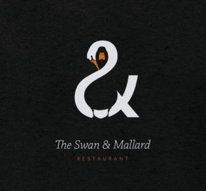
The last example we’ll show, this is another brilliant case of exploiting negative space to say more using less. The swan is visible at first, but it’s not long before the mallard emerges from the dark negative space. As if this wasn’t clever enough, you may also notice that the positive shape is actually an ampersand. This all comes together to create a shape that’s elegant, effective, and extremely memorable.
We hope this has inspired you to think a little more about how you can creatively use negative space in your next design. If you’re looking to custom-print t-shirts or other promotional products in Austin, San Marcos, San Antonio, or anywhere in Central Texas, give RiverCity Screenprinting & Embroidery a call at (888) 810–7385 to discuss your needs today!
All Logos are trademarked/copyrighted by their respective owners and are not affiliated with RiverCity Screenprinting & Embroidery.
