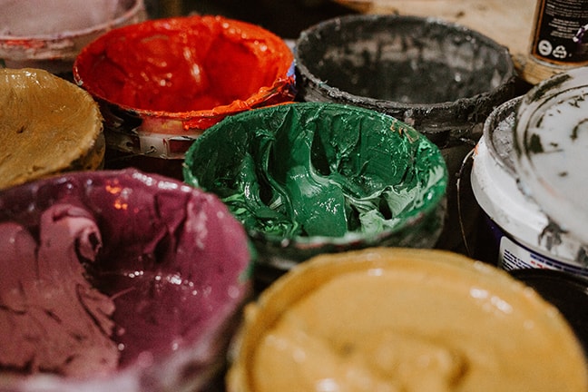
When you order a batch of screen-printed shirts for your company, you most likely wanted the printed image to be crisp and clear, with clearly defined colors and bright, vivid hues. Usually, printing companies would rely on the CMYK system, which mixed ink colors together during printing to produce varied results. Taken to another level, we have the option of using the Pantone Matching System (PMS), a system that uses pre-mixed inks for vivid and consistent results. Here’s just a few of the benefits of using the PMS system for your next printing job.
Consistency and Accuracy
The CMYK system required breaking each color into four parts (different percentages of cyan, magenta, yellow, and black), then mixing these parts together during the printing process. This complicated system often produced inconsistent results. The Pantone Matching System uses a single color and one or two plates during printing, meaning that each batch looks virtually identical. This consistency helps you build a reliable brand identity that your clients can connect with.
Bright, Vivid Colors
With the CMYK system, your colors are limited to different percentages of those same four colors. The Pantone Matching System’s pre-mixed inks allow for much more range, as well as deeper, more vivid hues. Instead of being forced to settle with a color that’s “close enough,” you’ll get rich, accurate hues that reflect what you envisioned. This system also offers colors that you can’t get with the CMYK system, like neon and certain neutrals.
Faster Printing and Less Cost
At times, PMS colors will get the job completed faster without paying extra, except for a minimal mixing charge. CMYK colors always require four plates, while PMS colors require only one or two per color. If you’re dealing with a limited-color image, PMS colors are easily the most cost-effective choice. If you’ve used CMYK colors in the past, many colors in your design can be accomplished more vibrantly with PMS colors.
Subtle Variations
The amount of range that PMS colors provide makes it easier to include small details or subtle color variations in your work, especially in monochromatic images. With the CMYK system, the colors might blend together, but the rich tones of PMS colors stand out. PMS colors are so effective that a well-designed logo won’t appear muddied or blended together, even when using different shades of the same color.
More Precise Text
Printing small text can be a challenge with the CMYK system, where the text can often appear blurry and hazy. Small text printed with PMS colors is crisp and legible. You won’t have to worry about the “fine print” being muddied or unreadable.
Overall, both systems of printing have their benefits, and both are still widely used today. But the Pantone Matching System provides the highest level of accuracy, as well as the richest colors. With PMS, you can even mix colors that you simply can’t get with the CMYK system. If you’re looking for a specific set of colors, it’s the best option for your money–and the level of consistency means that you’ll get a virtually flawless image every time.
Keep in mind, that the perception of one color will be affected by the surrounding color. So a bue would look much darker surrounded by black rather than white. Also, the amount of ink laid down, using halftones and varying meshes, can also mix with the garment color itself.
To get other tips dealing with inks and colors, you may want to check out our related articles Types of Inks Used In Screen Printing and Choosing The Right Colors and Inks For Custom Clothing.
For more information about the screen printing process, or if you would like to discuss an order, contact RiverCity Screenprinting and Embroidery, with locations in both San Marcos, TX and Austin, TX.


