
A color is a form of energy, as it is the perceivable representative of light. For instance, back in 1666, Sir Isaac Newton discovered that sunlight was a blend of colors. He noticed that when a ray of light passed through a prism, it dispersed into its seven integral colors: violet, indigo, blue, green, yellow, orange, and red.
Similarly, in designing, colors have unique characteristics and invoke different feelings or associations. Consider black, for instance. To some, black may represent elegance or an idea of prosperity; however, it may serve as a dark or an unpleasant reminder to others.
With that in mind, it is now clear that you cannot use a single color in your design, even if it is your logo, site, or business card. For it to be practical and appealing, there needs to be a combination of more than one color. Sadly, with the virtually unlimited range of color choices available to those working on computers today, coming to a wise decision on the combination of colors to use in a design has become a real challenge for many designers. Even those with a good deal of experience can make the wrong color choices and communicate the wrong message with their designs.
Thankfully, we’ve put together a handy guide to help designers, mainly web designers, to combat these situations. Through the lenses of psychology and color theory, we can better understand the cognitive associations and design principles that help create more harmonious color combinations.
Insights from Psychology
With the help of numerous studies, scientists continue to demonstrate the impact of colors on the human brain. For instance, have you ever wondered why Las Vegas is referred to as the city of red neon? Or rather have you ever asked yourself why it’s not associated with another color like blue?
The answers are quite simple yet very meaningful. The reason for naming Las Vegas red neon and not blue is because red makes people make riskier choices while blue is more gentle and calms the spirit. This is just one example of what numerous scientific studies demonstrate: specific colors trigger different reactions in human beings. This means that while some colors are exciting, others give the feeling of coolness and warmth or increase appetite.
Insights from Color Theory
One cannot simply choose a color scheme based on the associations or feelings the color invokes, however. The colors in a design need to work together aesthetically to avoid clashing or creating unintended visual effects. This is where color theory comes in; it’s the study of colors and their various properties. Understanding the basics of color theory not only helps designers in making informed color choices, but also in communicating the properties and characteristics of colors. Below, we’ll go over some of the fundamental properties and terms used to describe color.
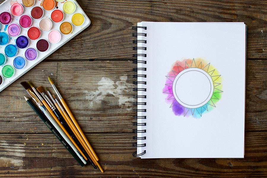
Primary Colors
Primary colors are colors that cannot be formed from others; that is, you cannot create them by combining other colors. In traditional color theory, they are the three primary pigments from which all colors can theoretically be created. These primary colors are blue, red, and yellow.
Secondary colors
These are colors created from mixing together two primary colors. On a color wheel, they fall exactly in the middle between two adjacent primary colors. In the case of pigments, these colors are purple, green, and orange.
Tertiary colors
These are colors derived from the combination of one primary and one secondary color. They are:
- Yellow and orange to marigold
- Yellow and green to chartreuse
- Blue and green to aquamarine
- Blue and purple to violet
- Red and orange to vermilion
- Red and purple to magenta
Additional Color Properties
Beyond categorizing colors, color theory provides us with a way to describe three key properties that all colors have: hue, saturation, and value.
- Hue refers to where a color falls on a color wheel. When we think of a color’s “identity,” we’re usually referring to its hue. In a scientific sense, a color’s hue depends on the wavelength of its electromagnetic energy.
- A color’s value measures the lightness or darkness of a color. A higher value means a color is closer to white, whereas a lower value indicates it’s closer to black.
- Intensity or saturation measures how dull or “colorful” a color is. One with higher saturation will be more vibrant and intense, whereas a lower-saturation color is closer to gray or mud.
By now, you have learned that color can be a great ally or your most fierce foe. To serve as a reminder, color is energy as light is energy, and as you all know, color is light.